Brand Identity
A consistent look across digital and physical touchpoints
A clear idea, brought into focus
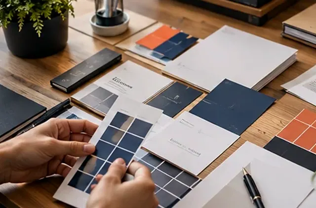
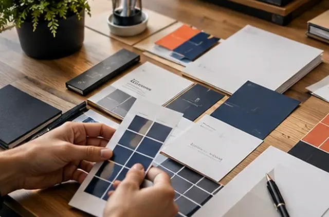
A useful visual identity is more than a single logo. Colours, type, image treatment and spacing should work together so that a website, social post and printed document feel connected. This is an illustrative identity system, not a real customer brand.
Visual direction, colour system, typography pairing and usage examples
Illustrative scope. A real project would have a separately agreed brief.How the project would come together
Our approach starts with the audience and the business personality. We test simple logo uses, explore supporting patterns and demonstrate how a small style guide helps keep future materials consistent.
A clear customer journey, not just a mockup
The business need
Help a growing company look consistent wherever potential customers discover it.
How the design could help
An adaptable logo system using approved assets, a color and type guide, and sample digital/print applications.
What a customer would do
A prospect sees consistent brand materials on the website, social profiles and printed items.
What we would verify
The proposed scope would be defined in a design brief; this is not a claim of brand recognition or revenue growth.
Concept demonstration only. It is a proposed scope—not evidence of completed client work or achieved business results.